Using LC.Charts with the ]chart3d user command
You can use the ]chart user command from any workspace to produce 3D charts from your APL variables, even from an empty clear workspace
Its syntax is:
      ]chart3d data {/bm=} {/caption=} {/chartcolors=} {/chartsymbols} {/charttypes} {/legend=} {/lm=} {/reflect=} {/risers=} {/rm=} {/spin=}
              {/symbol=} {/symbolsize=} {/ss} {/title=} {/tm=} {/topmost} {/tr} {/type=} {/version} {/vp=} {/xangle=}
              {/xlabels=} {/xmajstep=} {/xmax=} {/xmin=}
              {/ylabels=} {/ymajstep=} {/ymax=} {/ymin=}
              {/zmajstep=} {/zmax=} {/zmin=}
data must be a vector of numeric vectors.
Here is an example:
]chart3d ?6⍴⊂⌽50+10×⍳10 /ty=tower /ti=3D-Tower
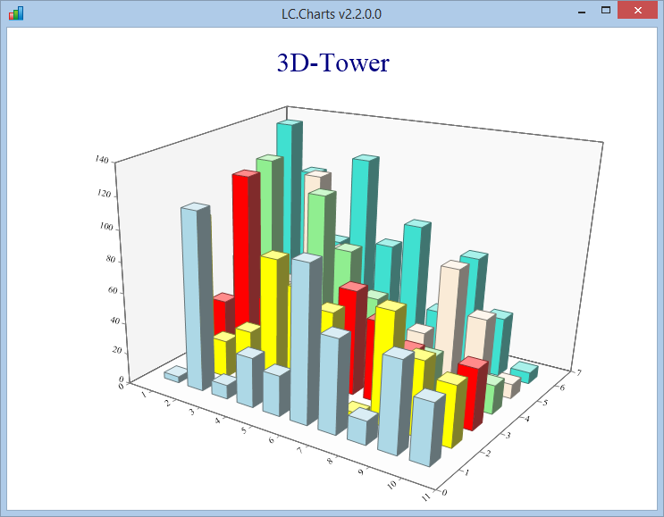
LC.Charts includes 10 different types of 3D charts.
3D charts can be animated and rotated using the ]spinit user command.
Look at this page for more 3D chart examples.
Using LC.Charts with the ]chart user command
You can use the ]chart user command from any workspace, even an empty clear workspace
Its syntax is:
      ]chart data {/adp} {/caption} {/cf} {/chartcolors=} {/chc} {/legend=} {/pl} {/plangle=} {/plformat=}
            {/smooth=} {/snofill} {/symb=} {/ssize=} {/title=} {/topmost} {/tr} {/type=} {/version}
            {/xangle=}  {/xmajstep=}{/xmin=} {/xminstep=} {/xmax=} {/xtitle=} {/xtype=}
            {/yangle=} {/ymajstep=} {/ymin=} {/yminstep=} {/ymax=} {/ytitle=} {/ytype=}
            {/overlay} {/reflect}
data can be an APL variable or an APL expression
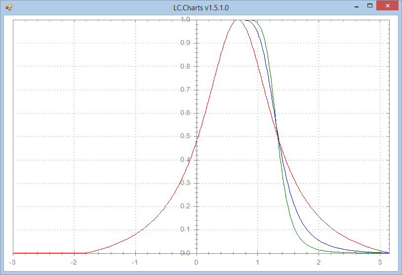
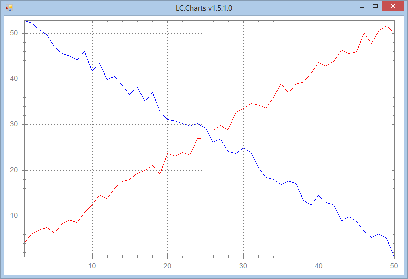
Here are some examples (scroll to the bottom of these page to see the corresponding charts):
      ⍝ Draw ?20⍴20
      ]chart ?20⍴20

      ⍝ Same chart with a title and point labels with a 30∘ angle
      ]chart aaa←?20⍴20 /pl /pla=30 /ti=Random Numbers

      ⍝ Same chart with point symbols with a symbol size of 12
      ]chart aaa /pl /pla=30 /ti=Random Numbers /symb=circle /ss=12

      ⍝ Same thing but with more options and a smoothed curve (using a tension of .5)
      ]chart aaa /pl /pla=30 /ymin=0 /xmax=21 /ymax=22 /sy=square /ti=Random Numbers Smoothed /sm=.5

      ⍝ Same thing but with more options and a smoothed curve (using a tension of .9)
      ]chart aaa /pl /pla=30 /ymin=0 /xmax=21 /ymax=22 /sy=square /ti=Random Numbers Smoothed /sm=.9

      ⍝ Draw the content of variable aaa
      aaa←1○.01×⍳1000
      ]chart aaa

      ⍝ Draw real life data contained in APL matrix SampleData1
      ]chart SampleData1

      ⍝ Same chart with a CrossHair Cursor
      ]chart SampleData1 /chc
You can use the ]chart user command detailed documentation by typing:
      ]chart?
]chart /chartaxistypes
]chart /chartcolors
]chart /chartsymbols
]chart /charttypes
]chart /properties
]chart /methods
]chart /doc=
]chart /version
]chart data {/adp} {/caption} {/cf} {/chartcolors=} {/chc} {/legend=} {/pl} {/plangle=} {/plformat=}
            {/smooth=} {/snofill} {/symb=} {/ssize=} {/title=} {/topmost} {/tr} {/type=} {/version}
            {/xangle=}  {/xmajstep=}{/xmin=} {/xminstep=} {/xmax=} {/xtitle=} {/xtype=}
            {/yangle=} {/ymajstep=} {/ymin=} {/yminstep=} {/ymax=} {/ytitle=} {/ytype=}
            {/overlay} {/reflect}

⎕wi property        /option         /option abbrev  Description
¯¯¯¯¯¯¯¯¯¯¯¯        ¯¯¯¯¯¯¯         ¯¯¯¯¯¯¯¯¯¯¯¯¯¯  ¯¯¯¯¯¯¯¯¯¯¯¯¯¯¯¯¯¯¯¯¯¯¯¯¯¯¯¯¯¯¯¯¯¯¯¯¯¯¯¯¯¯¯¯¯¯¯¯¯¯¯¯¯¯¯¯¯¯¯¯¯¯¯¯¯¯¯¯¯¯¯¯¯¯¯
                    /chartaxistypes /charta         Return the possible X-Axis or Y-axis scale types
                    /chartcolors=   /chartc=        Get or set the 22 colors used by LC.CHarts
                    /chartsymbols   /charts         Return the possible point symbols you can use
                    /charttypes     /chartt         Return the possible chart types you can use
                    /doc=           /doc=           Return the documentation for a given property (example: /doc=xSymbol)
                    /methods        /m              Return the LC.Charts available methods
                    /properties     /pr             Return the LC.Charts available properties
                    /tr             /tr             Displays the chart form topmost and at top right of the screen
                    /version        /v              Return the LC.Charts.dll version number

xAllowDragPoint     /adp            /adp            Allow dragging points and point labels
xCaption            /caption=       /ca=            Set the LC.Charts Form caption
xCurveFill          /cf=            /cf=            Set the curve fill factor (¯99 to 99)
xCrossHairCursor    /chc            /chc            Make the CrossHair Cursor visible
xLegend             /legend=        /le=            Set the legend (comma separated string)
xOverlay            /overlay        /o              Allows to overlay a chart on another chart
xPointLabels        /pl             /pl             Make the point labels visible (for scatter and curve)
xPointLabelsAngle   /plangle=       /pla=           Set the point labels angle
xPointLabelsFormat  /plformat=      /plf=           Set the point labels format using a .Net format string
                                                    (check: http://www.cheat-sheets.org/saved-copy/msnet-formatting-strings.pdf)
xReflect            /reflect        /r              Sets the xReflect property to 1 so that property changes are immediately reflected on the chart
xSmooth             /smooth=        /sm=            Set the smooth tension factor (0=no smoothing, 1=maximum smoothing)
xSymbol             /symb=          /sy=            Point symbol (one of:
                                                    circle, default, diamond, hdash, none, plus, square, star, triangle, triangledown, vdash or xcross)
xSymbolFill         /snofill        /sn             Do not fill point symbols
xSymbolSize         /ssize=         /ss=            Set the symbol size (default is 8)
xTitle              /title=         /ti=            Chart title
xTopMost            /topmost        /to             Forces the chart window to be topmost
xType               /type=          /ty=            Sets the chart type (one of: bar, curve, pie, scatter)
xXAngle             /xangle=        /xa=            Set the X-labels angle (0 to 360)
xXMajorStep         /xmajstep=      /xmaj=          Set the X-Axis major step value
xXMax               /xmax=          /xmax=          Set the X-Axis maximum value
xXMin               /xmin=          /xmin=          Set the X-Axis minimum value
xXMinorStep         /xminstep=      /xmins=         Set the X-Axis minor tickmark step value
xXAxisTitle         /xtitle=        /xti=           Set the X-Axis title
xXAxisType          /xtype=         /xty=           Set the X-Axis scale type (linear, log)
xYAngle             /yangle=        /ya=            Set the Y-labels angle (0 to 360)
xYMajorStep         /ymajstep=      /ymaj=          Set the Y-Axis major tickmarck step value
xYMax               /ymax=          /ymax=          Set the Y-Axis maximum value
xYMin               /ymin=          /ymin=          Set the Y-Axis minimum value
xYMinorStep         /yminstep=      /ymins=         Set the Y-Axis minor tickmarck step value
xYAxisTitle         /ytitle=        /yti=           Set the Y-Axis title
xYAxisType          /ytype=         /yty=           Set the Y-Axis scale type (linear, log)

Notes:
1. You must supply a value for options with are ending with = above
2. The chart title, x-axis title, y-axis title and legend are not shown by default
3. Set the chart title, x-axis title and/or y-axis title to a non empty string to show them
4. Set the /symb= option to one of the possible symbol types to display point symbols
5. Use:  /pl  to display point labels
6. Use:  /sn  to not fill point symbols
7. For pie charts, the supplied data must be a 2-element nested vector with [1]=numeric vector [2]=string vector
8. You can prefix any option value with ⍎ to instruct ]chart to execute the option value
   Example:
   legend←'France,USA'
   ]chart 20 3⍴⍳100 /le=⍎legend

Note: this User Command requires the LC.Charts.dll C# ActiveX DLL to have been propertly registered

Example:
    ]chart 1○.1×⍳10000 /xmin=0 /xmax=1000
    ]chart ?20⍴20 /ty=bar
    ]chart (10 20 30)('Oranges' 'Bananas' 'Lemons') /ty=pie
    aaa←20 3⍴0
    aaa[;1]←⍳20
    aaa[;2]←((⍳20)*.5)+.1ׯ6+?20⍴6
    aaa[;3]←⌽((⍳20)*.5)+.1ׯ6+?20⍴6
    ]chart aaa /pl /pla=0 /plf=G3 /xmax=21 /sy=square /ss=10 /ti=My Sample Chart
And, of course, you can use the ]chart user command under program control
using ⎕ucmd']chart ...'
Using LC.Charts as an ActiveX object
You first need to create an instance of the ActiveX object:
      'ff'⎕wi'*Create' 'LC.Charts.Chart'
ff
The C# chart form is not shown by default.
You can then simply use the xData property to send the data you want to plot and use the XShow method to display the form:
      ]uload SampleData1

      'ff'⎕wi'*xData'SampleData1
      'ff'⎕wi'*XShow'
So this is very simple.
Of course, you could also have set a number of properties before calling the XShow method to customize your chart
(not that, if you set properties after the xData property, you need to call the XRedraw method
for your changes to be taken in account):
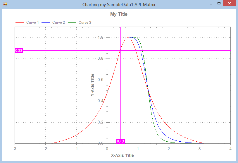
      'ff'⎕wi'*xCaption' 'Charting my SampleData1 APL Matrix'
      'ff'⎕wi'*xLegend' 'Curve 1' 'Curve 2' 'Curve 3'
      'ff'⎕wi'*xLegendVisible'1
      'ff'⎕wi'*xXMax'4
      'ff'⎕wi'*xYMax'1.1
      'ff'⎕wi'*xCrossHairCursor'1
      'ff'⎕wi'*XRedraw'
The available properties, methods and events are:
      100 TELPRINT⊃'ff'⎕wi'*properties'
apldata       properties        xLegendBorder       xTitleFont         xY2AxisMagAuto
children      self              xLegendFont         xTitleVisible      xY2AxisTitle
class         state             xLegendPosition     xTopMost           xY2AxisTitleFont
clsid         suppress          xLegendPositions    xType              xY2MajorStep
data          unicodebstr       xLegendVisible      xUseY2Axis         xY2Max
def           version           xLineColor          xVersion           xY2Min
description   xAllowDragPoint   xLineStyle          xWhere             xY2MinorStep
errorcode     xAllowZoom        xLineStyles         xXAngle            xYAngle
errormessage  xAxisColor        xLineWidth          xXAxisFormat       xYAxisAtX
events        xCaption          xMagAuto            xXAxisLabelsFont   xYAxisFormat
instance      xChartAxisTypes   xOutsideColor       xXAxisMagAuto      xYAxisLabelsFont
interface     xChartColors      xOverlay            xXAxisTitle        xYAxisMagAuto
links         xChartSymbols     xPointLabels        xXAxisTitleFont    xYAxisTitle
methods       xChartTypes       xPointLabelsAngle   xXAxisType         xYAxisTitleFont
modified      xCrossHairCursor  xPointLabelsFormat  xXMajorStep        xYAxisType
modifystop    xCurveFill        xReflect            xXMax              xYMajorStep
name          xData             xSmooth             xXMin              xYMax
obj           xFontsScaled      xSymbol             xXMinorStep        xYMin
opened        xHandle           xSymbolFill         xXTitleVisible     xYMinorStep
pending       xInsideColor      xSymbolSize         xY2AxisFormat      xYTitleVisible
progid        xLegend           xTitle              xY2AxisLabelsFont

      100 TELPRINT⊃'ff'⎕wi'*methods'
Close      Send                 XEuroDollarRates       XSmoothDoc        XXMajorStepDoc
Create     Set                  XGetScalingFactor      XSymbolDoc        XXMaxDoc
Defer      SetLinks             XHandleDoc             XSymbolFillDoc    XXMinDoc
Delete     XAddText             XLegendDoc             XSymbolSizeDoc    XXMinorStepDoc
EnumEnd    XAllowDragPointDoc   XLegendVisibleDoc      XTitleDoc         XXTitleVisibleDoc
EnumNext   XCaptionDoc          XLocalizeTo            XTitleVisibleDoc  XYAngleDoc
EnumStart  XChartAxisTypesDoc   XLocalizeToDoc         XTopMostDoc       XYAxisAtXDoc
Event      XChartColorsDoc      XOverlayDoc            XTypeDoc          XYAxisTitleDoc
Exec       XChartSymbolsDoc     XPointLabelsAngleDoc   XVersionDoc       XYAxisTypeDoc
Info       XChartTypesDoc       XPointLabelsDoc        XWait             XYMaxDoc
Modify     XClose               XPointLabelsFormatDoc  XWhereDoc         XYMinDoc
New        XCrossHairCursorDoc  XRedraw                XXAngleDoc        XYTitleVisibleDoc
Open       XCurveFillDoc        XReflectDoc            XXAxisTitleDoc
Ref        XDataDoc             XShow                  XXAxisTypeDoc

     100 TELPRINT⊃'ff'⎕wi'*events'
Action  Close  Delete  Modified  Open  Reopen  Send
Recommended Use
It is recommended that you use LC.Charts with the ]chart user command rather than as an ActiveX.
The main reason is that there is much less to type to get your chart on the screen as you want it when using ]chart
than when using the ActiveX.
However, to keep the ]chart simple enough, not all the LC.Charts properties have been added as
]chart command options. And over time more properties and methods may be added to the ActiveX
and probably not to the ]chart command to keep it simple.
Examples
Here are a series of examples, using LC.Charts:
Simple chart of an APL matrix variable
SampleData3←30 3⍴0
SampleData3[;1]←⍳30
SampleData3[;2]←(⍳30)+.1×?30⍴40
SampleData3[;3]←⌽(⍳30)+.1×?30⍴40
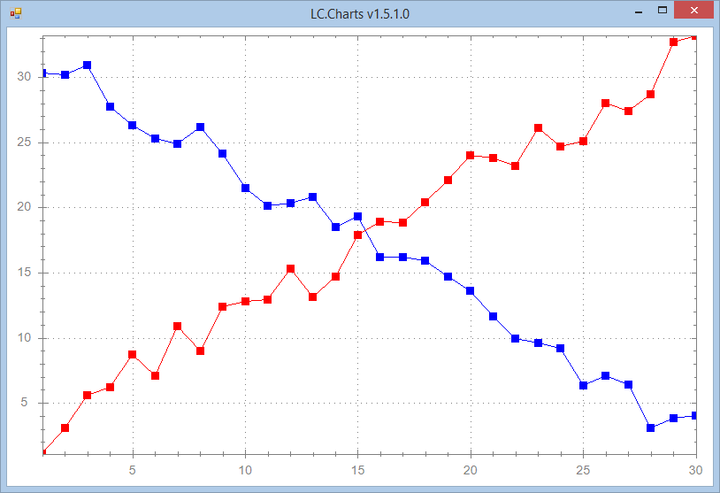
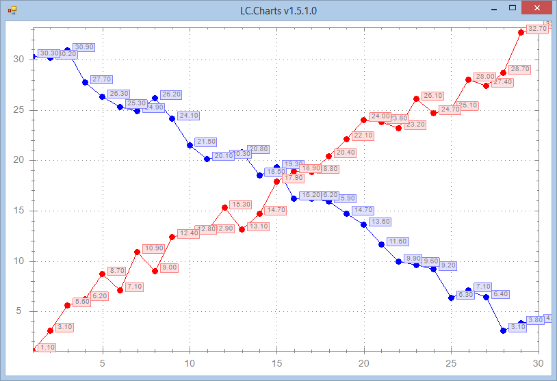
]chart SampleData3
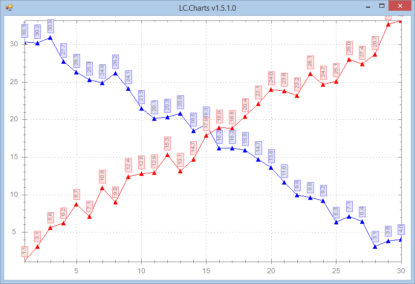
Adding point symbols (may use: circle, default, square, diamond, hdash, none, plus, square, star, triangle, triangledown, vdash or xcross):
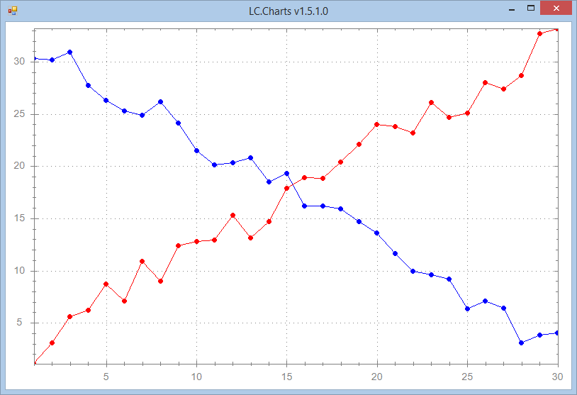
]chart SampleData3 /sy=square
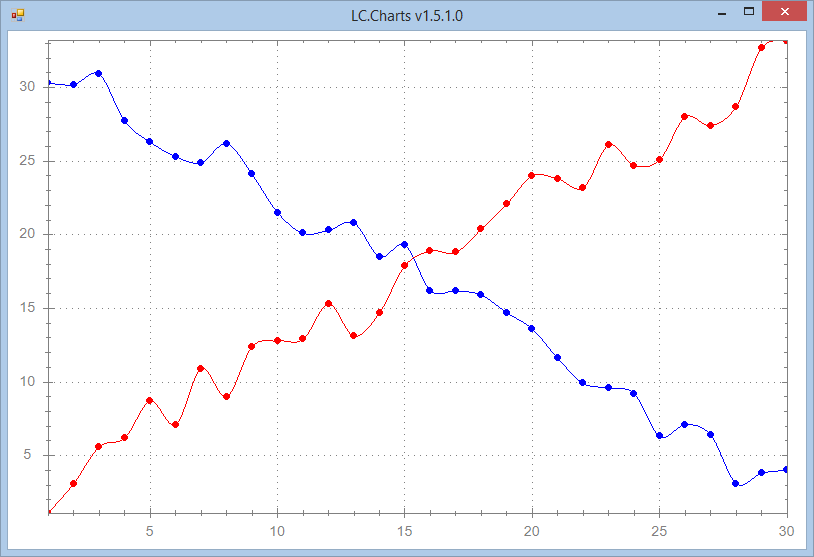
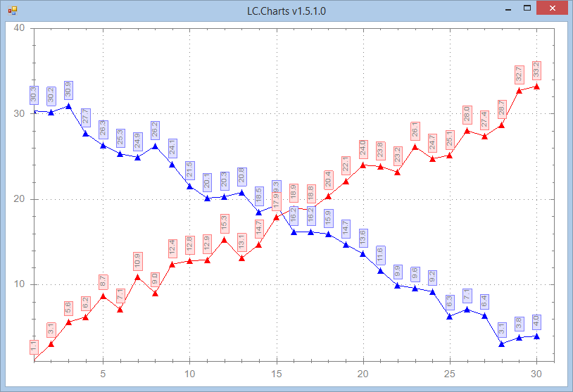
Setting the point symbol size
]chart SampleData3 /sy=circle /ss=6
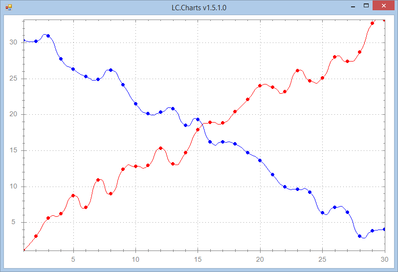
Smoothing the curves
]chart SampleData3 /sy=circle /ss=6 /sm=.5
Using different smoothing tensions (choose between 0=no tension and 1=maximum tension):
]chart SampleData3 /sy=circle /ss=6 /sm=1
Adding point labels
]chart SampleData3 /sy=circle /pl
Changing point label orientation (any angle between 0 and 360) and format (use .Net Framework number formats)
]chart SampleData3 /sy=triangle /pl /pla=90 /plf=#.0
Changing the X-Axis and Y-Axis maximum values
]chart SampleData3 /sy=triangle /pl /pla=90 /plf=#.0 /lv /xmax=31 /ymax=40
You can also change the X-Axis and Y-Axis minimym values with /xmin= and /ymin=
Draw a pie chart
]chart (10 20 30 40)('Oranges' 'Bananas' 'Apples' 'Lemons') /ty=pie /lv
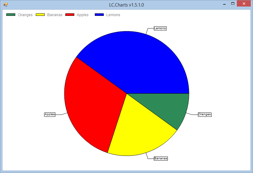
For pie charts, you need to supply a 2-element nested vector with the values and the labels. The /lv option means: make the legend visible.
Draw a bar chart
]chart ?20⍴20 /ty=bar
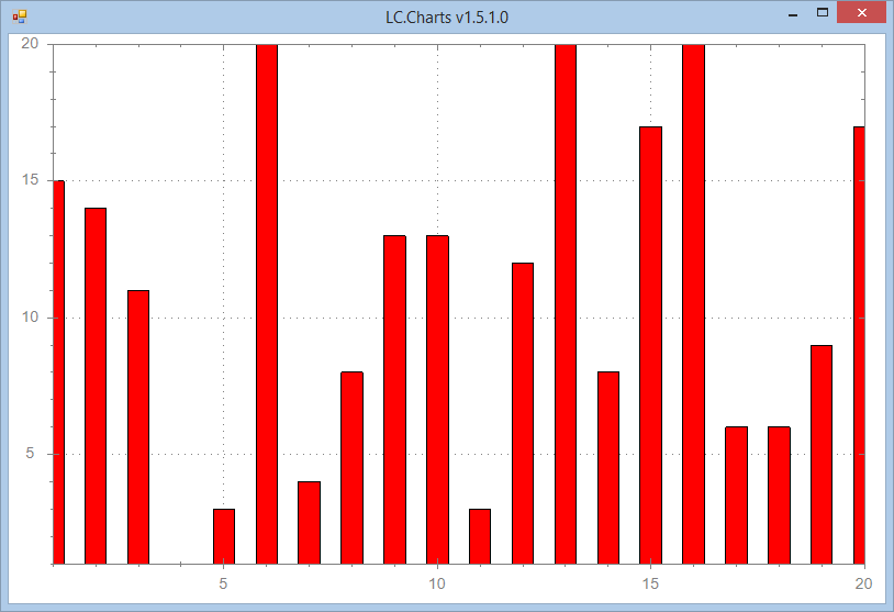
/ty stands for type of chart.
Draw a side by side bar chart
      SampleData4←20 3⍴0
      SampleData4[;1]←⍳20
      SampleData4[;2]←?20⍴100
      SampleData4[;3]←SampleData4[;2]+¯10+?20⍴20  ⍝ add noise

      ]chart SampleData4 /ty=bar /xmin=0 /xmax=21 /ymax=102
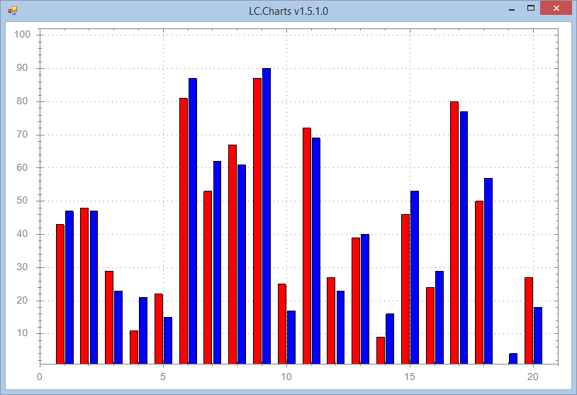
When supplying a APL matrix variable to the LC.Charts object for drawing, whether as a bar chart or a curve chart, your matrix
must contain:
- X-coordinates (abscissas) in the 1st column
- Y-coordinates of the various bars or curves in the other columns.
Scatter plot with Point Labels
]uload SampleData5
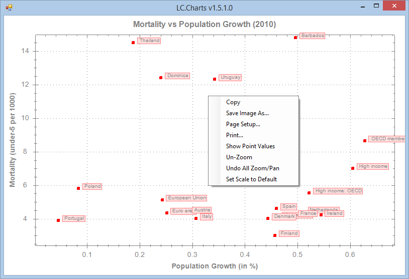
]chart (SampleData5[;3 4])(SampleData5[;2]) /ty=scatter /pl /ss=5 /xmax=6 /ymax=140 /ti=Mortality vs Population Growth (2010) /yti=Mortality (under-5 per 1000) /xti=Population Growth (in %)
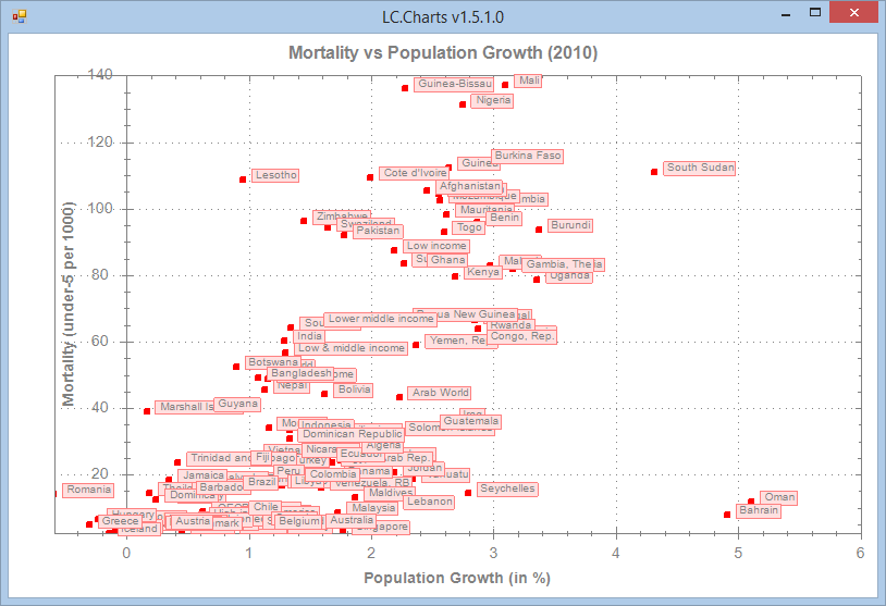
Notes: data downloaded from http://data.worldbank.org/topic/climate-change
There seems to be a relation between Mortality under 5 per 1000 capita and the Population Growth!
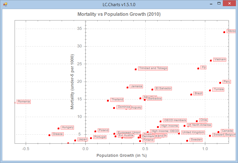
Zooming more to explore low Population Growth and Low Mortality
Let's zoom in for more details
]chart (SampleData5[;3 4])(SampleData5[;2]) /ty=scatter /pl /ss=5 /xmax=6 /ymax=140 /ti=Mortality vs Population Growth (2010) /yti=Mortality (under-5 per 1000) /xti=Population Growth (in %)
Zooming even more and using the context menu for maybe printing or copying to clipboard
]chart (SampleData5[;3 4])(SampleData5[;2]) /ty=scatter /pl /ss=5 /xmax=6 /ymax=140 /ti=Mortality vs Population Growth (2010) /yti=Mortality (under-5 per 1000) /xti=Population Growth (in %)
More examples with real data and with more ]chart options
The delivered LCCHARTS.SF UCMD file includes some data downloaded from the World Bank.
      ]uload worlddata Countries DataItems WorldDataEvolution

      ⍝ The available data are:

      ]data
  1 Agricultural land (km2)                                        12 Electricity prod. coal based (% of total)
  2 Agricultural land (%)                                          13 Electricity prod. hydroelectric based (% of total)
  3 Population growth (annual %)                                   14 Electricity prod. natural gas based (% of total)
  4 Population (total)                                             15 Electricity prod. nuclear based (% of total)
  5 Urban population growth (annual %)                             16 Electricity prod. oil based (% of total)
  6 Urban population                                               17 Electricity prod. (kWh)
  7 Urban population (% of total)                                  18 Electricity prod. renewable sources (kWh)
  8 Cereal yield (kg/ha)                                           19 Electricity prod. renewable sources, not hydro (kWh)
  9 Population in cities > 1 million (% of total pop.)             20 Electricity prod. renewable sources, not hydro (% of total)
 10 Mortality rate under-5 (per 1000 live births)                  21 Energy use (kt of oil equivalent)
 11 GDP (current US$)                                              22 Energy use (kg of oil equivalent per capita)

      ⍝ The available countries are:

      ]countries
  1 Australia          4 Switzerland        7 Finland           10 Greece            13 Japan             16 Sweden
  2 Austria            5 Denmark            8 France            11 Ireland           14 Netherlands       17 Turkey
  3 Canada             6 Spain              9 United Kingdom    12 Italy             15 Portugal          18 United States

      ⍝ The WorldDataEvolution function extracts data from the <worlddata>
      ⍝ variable and structure it so that it can be plotted with ]chart
      ⍝ The left argument is an <data> number
      ⍝ The right argument is one or more <country> numbers

      ⍴10 WorldDataEvolution 3 8 10 16 17 18
52 7

      5↑[1]10 WorldDataEvolution 3 8 10 16 17 18
 Mortality rate under-5 (per 1000 live births) Canada France Greece Sweden Turkey United States
                                          1962   30.5   25.7   52.7   18.6  239.6          28.9
                                          1963   29.4   24.5   51.1   17.9  232.3          28.3
                                          1964   28.2   23.4   49.4   17.1  225.3          27.7
                                          1965   27.1   22.3   47.7   16.3  218.5          27.1
      ...
So let's draw some charts
      data←10 WorldDataEvolution 3 8 10 16 17 18
      legend←Countries[3 8 10 16 17 18]
      legend
 Canada France Greece Sweden Turkey United States

      ]chart 1 0↓data /le=⍎legend /ti=⍎⎕first data[1;1] /sy=square /ss=5 /xa=30 /xmaj=1
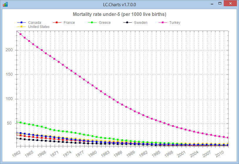
Note the use of the ⍎ prefix in some options: it allows you to get the option value by excuting some APL expression. This makes
the ]chart command very flexible and dynamic.
In this chart we used a point symbol of square a point symbol size of 5 pixels, an X-Axis labels angle of 30° and an X-Axis
major tick step of 1. Note that the ]chart command chooses by itself what labels to display on the X-Axis.
For example, if we make the chart wider, we get:
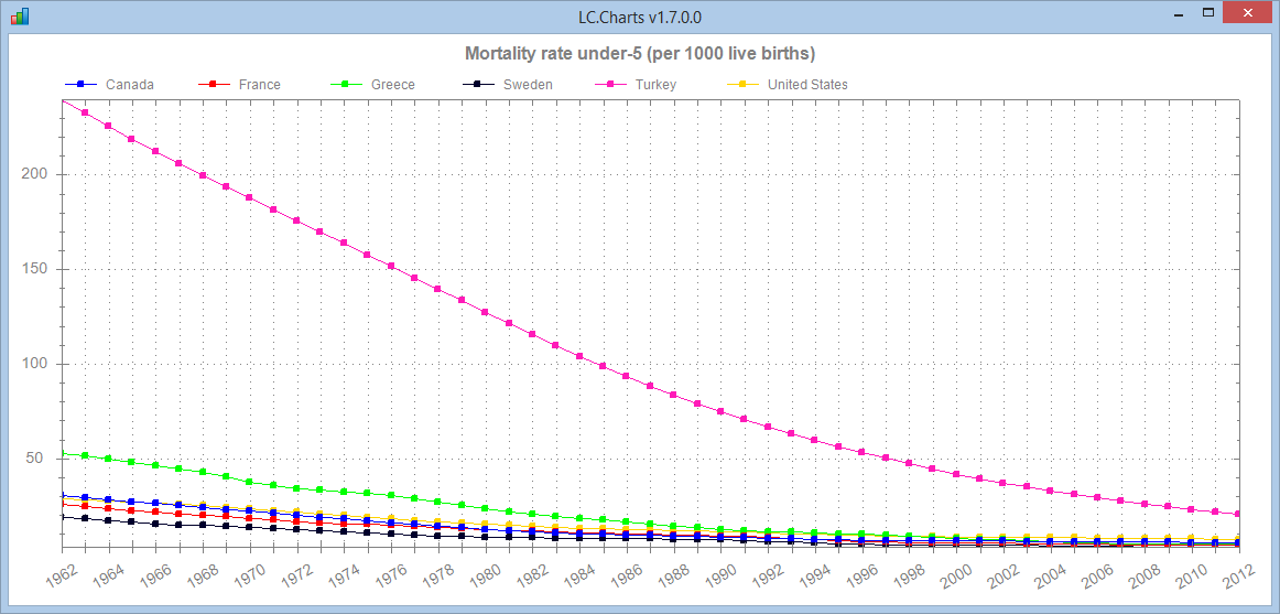
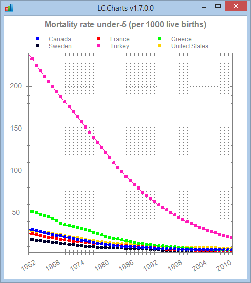
and if we make it narrower:
At any time you can query the available choices for some properties:
      ]chart /chartsymbols
 circle default diamond hdash none plus square star triangle triangledown vdash xcross

      ]chart /charttypes
 bar curve pie scatter

      ]chart /chartaxistypes
 date dateasordinal exponent linear linearasordinal log ordinal text

      ]chart /chartcolors
 0 0 255  255 0 0  0 255 0  0 0 43  255 26 184  255 211 0  0 87 0  131 131 255  158 79 70  0 255 193  0 131 149  0 0 123  149 211 79  246 158 219  211 17 255  123 26 105
       246 17 96  255 193 131  35 35 8  140 167 123  246 131 8  131 114 0
Animated Graphics
It is easily possible to create animated graphics: it is a perfect way to see how data changes over time.
The WorldDataAnimation function in the LCCHARTS User Command file can do that.
Let's plot 2 data variables against each other and see their evolution from 1962 to 2012:
      ]uload WorldDataAnimation

      ⎕vr'WorldDataAnimation'
    ∇ items WorldDataAnimation countries;allcountries;bool;dataItems;data1;data2;i;x;y;z;⎕io
[1]   ⍝∇ items WorldDataAnimation countries -- Shows an animation of world cross data evolution from 1961 to 2012
[2]   ⍝∇ items ←→ an integer scalar (see ]data to see possible choices)
[3]   ⍝∇ countries ←→ '' for a selection of 11 countries
[4]   ⍝∇           or a vector of country numbers (see ]countries to see possible choices)
[5]   ⍝∇ Requires: (F) Countries DataItems
[6]   ⍝∇           (V) worlddata (source: data downloaded from http://data.worldbank.org/topic/climate-change)
[7]   ⍝∇ ELE6jan15
[8]
[9]   ⎕io←1
[10]  dataItems←DataItems[items]
[11]  allcountries←Countries
[12]  :if 0∊⍴countries ⋄ countries←1 3 5 6 8 9 10 13 16 17 18 ⋄ :endif
[13]  bool←1,(⍳⍴allcountries)∊countries
[14]  (data1 data2)←⊂[2 3]bool/[2]worlddata[items;;]
[15]
[16]  z←'ff'⎕wi'*Create' 'LC.Charts.Chart'
[17]  z←'ff'⎕wi'*XShow'
[18]  z←'ff'⎕wi'*xXMin'(⌊/,1 0↓0 1↓0 ¯2↓data1)
[19]  z←'ff'⎕wi'*xXMax'(1.1×⌈/,1 0↓0 1↓0 ¯2↓data1)
[20]  z←'ff'⎕wi'*xYMin'(⌊/,1 0↓0 1↓0 ¯2↓data2)
[21]  z←'ff'⎕wi'*xYMax'(1.05×⌈/,1 0↓0 1↓0 ¯2↓data2)
[22]  z←'ff'⎕wi'*xSymbol' 'square'
[23]  z←'ff'⎕wi'*xSymbolSize'8
[24]  z←'ff'⎕wi'*xType' 'scatter'
[25]  z←'ff'⎕wi'*xXAxisTitle'(1⊃dataItems)
[26]  z←'ff'⎕wi'*xYAxisTitle'(2⊃dataItems)
[27]  :for i :in 1↓¯2↓⍳2⊃⍴data1
[28]      x←1↓data1[;i]
[29]      y←1↓data2[;i]
[30]      z←'ff'⎕wi'*xData'(x,[1.5]y)(1↓data1[;1])
[31]      z←'ff'⎕wi'*xPointLabels'1
[32]      z←'ff'⎕wi'*xTitle'(⍕data1[1;i])
[33]      z←'ff'⎕wi'*XRedraw'
[34]      z←⎕dl.1
[35]  :endfor
[36]
    ∇

      ⍝ Plot 9=Population in Cities > 1 million (% of total population)
      ⍝ against 4=Population (total)

      9 4 WorldDataAnimation ''
I have captured 2 frames from the animation: state in year 1969 and state in 2012:
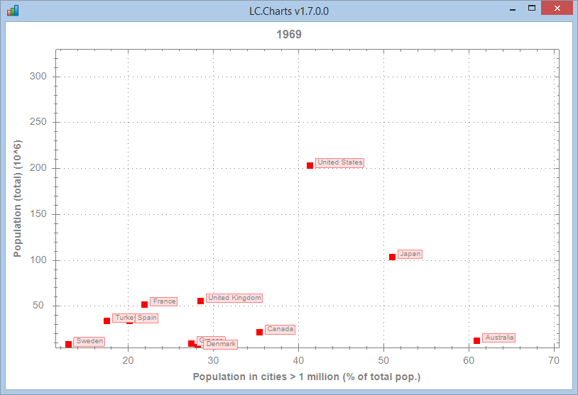
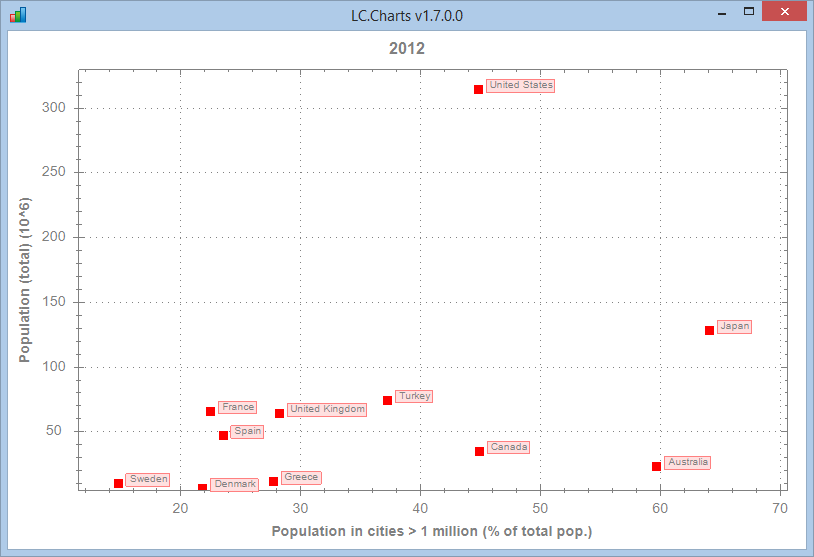
Doing such animated graphs can teach a lot.
Needing little code to display spectacular charts
      ]uload Butterfly

      ⎕vr'Butterfly'
    ∇ Butterfly;t;v;x;y;In;To;⎕io
[1]   ⍝∇ Butterfly -- Draws a Butterly using LC.Charts.dll
[2]   ⍝∇ ELE3jan15
[3]   ⎕io←1
[4]   ⎕ucmd']uload In To /quiet'
[5]   t←0 To(21×○1)In 2000
[6]   v←((1○t÷12)*5)+(*2○t)-2×2○4×t
[7]   x←v×1○t
[8]   y←v×2○t
[9]   ⎕ucmd']chart x,[1.5]y /ti=Butterfly'
    ∇

      Butterfly
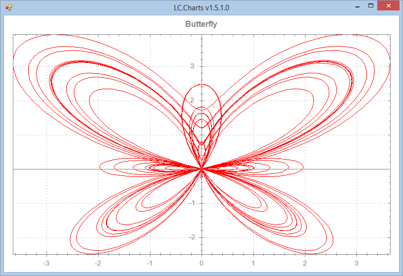
The above Butterfly APL function uses some maths cartesian equation to draw this nice Butterly with LC.Charts.
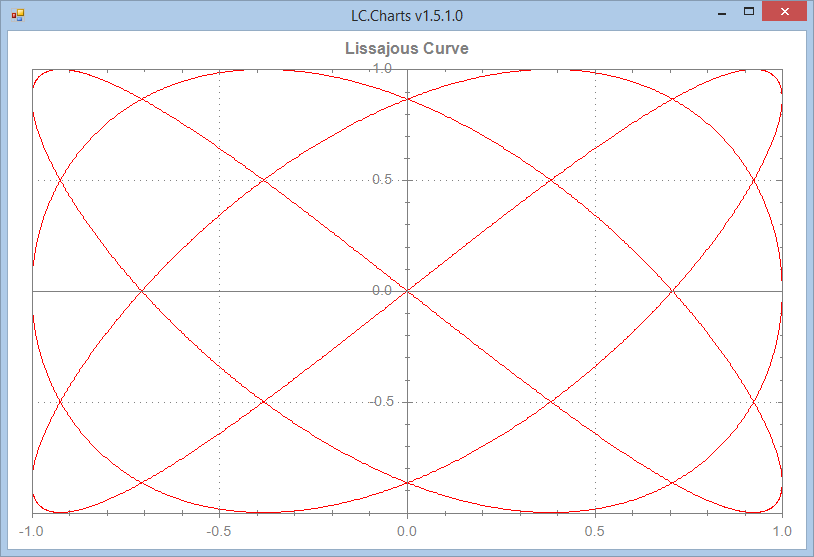
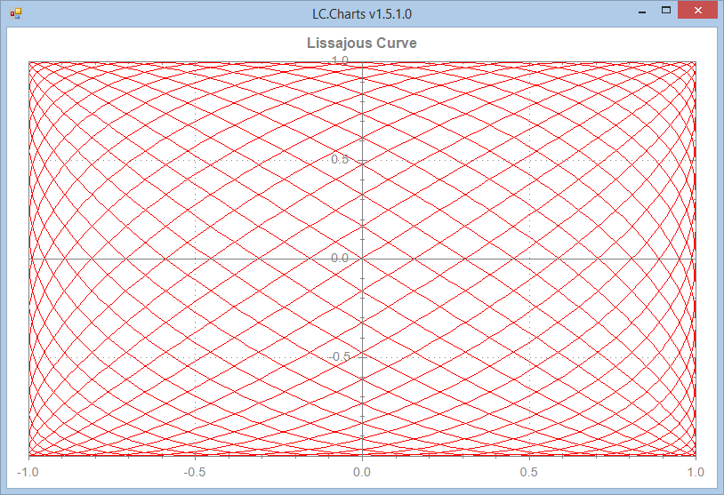
Animated Charts
LC.Charts is so fast that you can animate a chart to show the evolution of one or more curves over time and the animation you get is perfectly fluid.
The Lissajous APL function below demonstrates how to do this. Of course you won't see the animation on this Web page, but try it when you have downloaded LC.Charts.
It is a suprisingly smooth animation!
      ]uload Lissajous

      ⎕vr'Lissajous'
    ∇ Lissajous n;a;b;c;i;n;t;x;y;z;In;To;d
[1]   ⍝∇ Lissajous n -- Demonstrates how to draw animated curves with LC.Charts
[2]   ⍝∇ ELE3jan15
[3]   ⎕ucmd']uload In To /quiet'
[4]   (c d)←n
[5]   t←0 To(2×○1)In 4000
[6]   a←1 To c In 400
[7]   b←1 To d In 400
[8]   z←'ff'⎕wi'*Create' 'LC.Charts.Chart'('*∆t't)('*xTitle' 'Lissajous Curve')('xXMin'¯1)('*xXMax'1)
[9]   z←'ff'⎕wi'*XShow'
[10]  :for i :in⍳⍴a
[11]      x←1○a[i]×t
[12]      y←1○b[i]×t
[13]      'ff'⎕wi'*xData'(x,[1.5]y)
[14]      z←⎕dl.01
[15]  :endfor
    ∇

      Lissajous 1 2
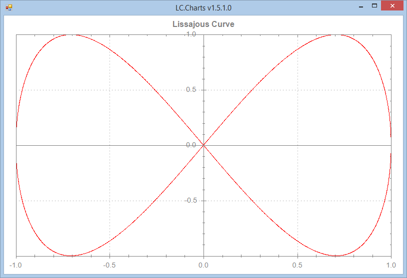
Lissajous 3 4
Lissajous 19 20
Enjoy and please Email me a copy of some of the charts you create with LC.Charts!